I feel it's been a good year in cartography. Since I started this blog, focusing on cartographic howlers, the various tools with which people make maps have improved and the quality of maps is also improving. Maybe there's some learning going on? Maybe people are striving for a better product? Maybe it's just harder to make mistakes? Whatever the mix of forces at work, I've woken more often to a decent diet of maps across social media than in previous years which can only be a good thing.
<div>Of course there's still real humdingers and cartofails but there always will be. The balance seems to be shifting as defaults in mapping tools improve and, hopefully, people's acceptance of sub-par products is waning. I've always maintained that quality beats quantity and great maps will always outshine the rest. It's therefore pleasing to see so many year-end reviews focus on what are actually good maps rather than just a list of viral click-bait cartography. I've seen some great maps this year and the fact this blog was difficult to compile to keep it to a manageable length is testament to that fact.
We've seen a good number of new books on cartography this year too. Jonathan Crowe put together his usual review so head on over there to see the highlights. I'm bound to put in a little plug for MAP (Phaidon Press) because I had some involvement. Lovely Christmas book for that map-mad family member or friend. Others are available.
Some year-end reviews are already out there which are well worth a look (Visualoop interactive maps part 1, Visualoop interactive maps part 2, Visualoop print infographics, Maps Mania). They generally focus on online/interactive maps although Visualoop's print infographics selections include many high-quality map-based products. Thanks to those who put some of my work in their lists")
Here, then, I'd like to offer my selection of my favourite maps of the year which go beyond just reviewing what you can access online. Some you'll have seen because they are shared widely on the internet. Some I saw at various conferences and use that odd technique called 'printing and publishing'. That means they are on a medium called 'paper' so they might not have got the 'likes' that web offerings can garner. My criteria are simple...the map made me want to spend time with it. It was pleasing to look at and functions well in the context of its purpose. Sometimes I wanted to use the map to find something out. Sometimes I just wanted to look at it and enjoy.
So in no particular order...
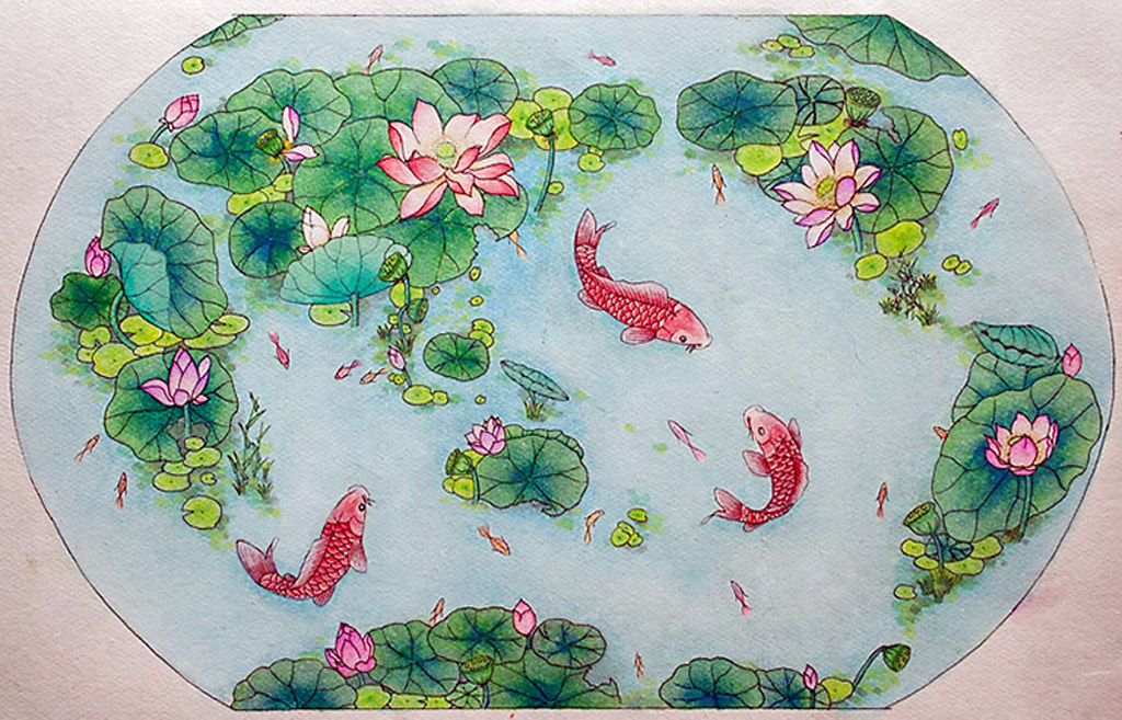
A world of lotus, a world of harmony by Liao Zhi Yuan
A lovely little hand-drawn map by 15 year old Liao Zhi Yuan from China who won an award at the ICA Children's Map competition in Rio. Such a simple idea and beautifully drawn.

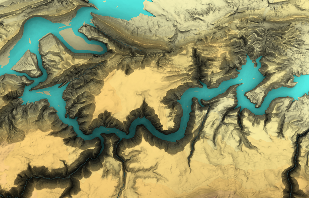
Flaming Gorge by Patrick Kennelly
Wonderfully atmospheric terrain rendering with sumptuous use of colour to pick out the water. Rather than just pick out terrain, the technique includes complex shadowing to create a stunning depth of tonal variation.

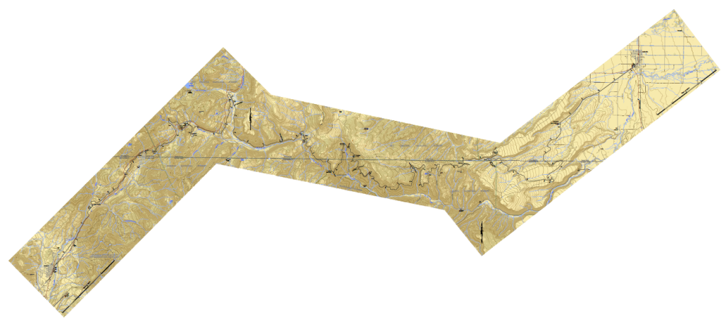
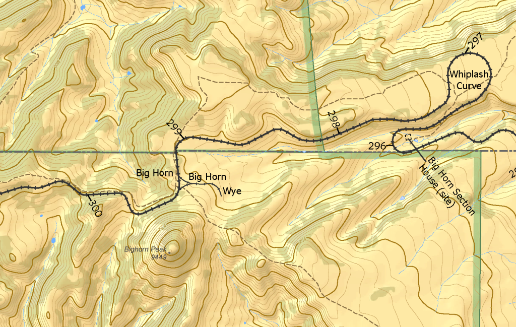
Route guide for the Cumbres & Toltec Scenic Railroad by Doug Cain
Situating the figural railroad against a beautiful backdrop, this is an old style strip map presented in three overlapping sections. Not every map has to fall in a single rectangle!


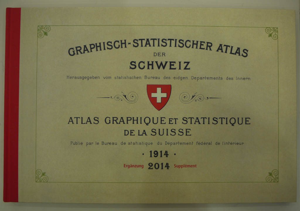
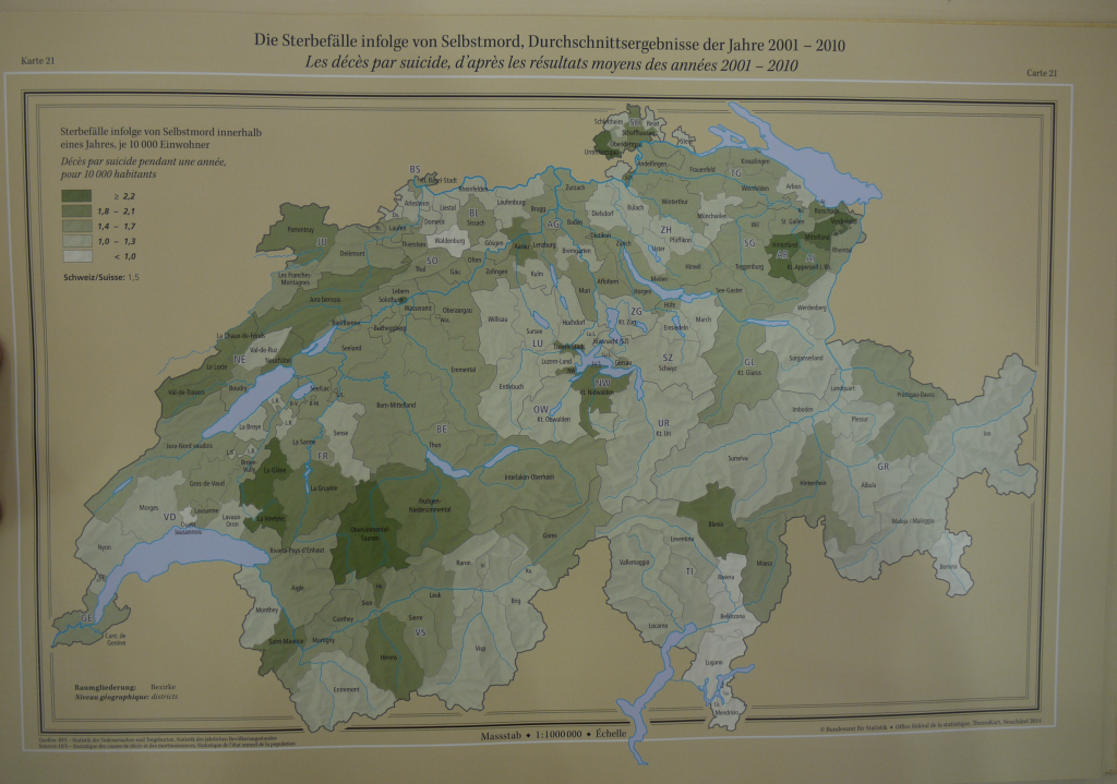
Graphical and Statistical Atlas of Switzerland 1914–2014 by Federal Statistical Office
A perfect example of how to make a thematic map atlas. great use of colour, typography and layout. If web cartographers want something to aim for in terms of visuals...just study this atlas.


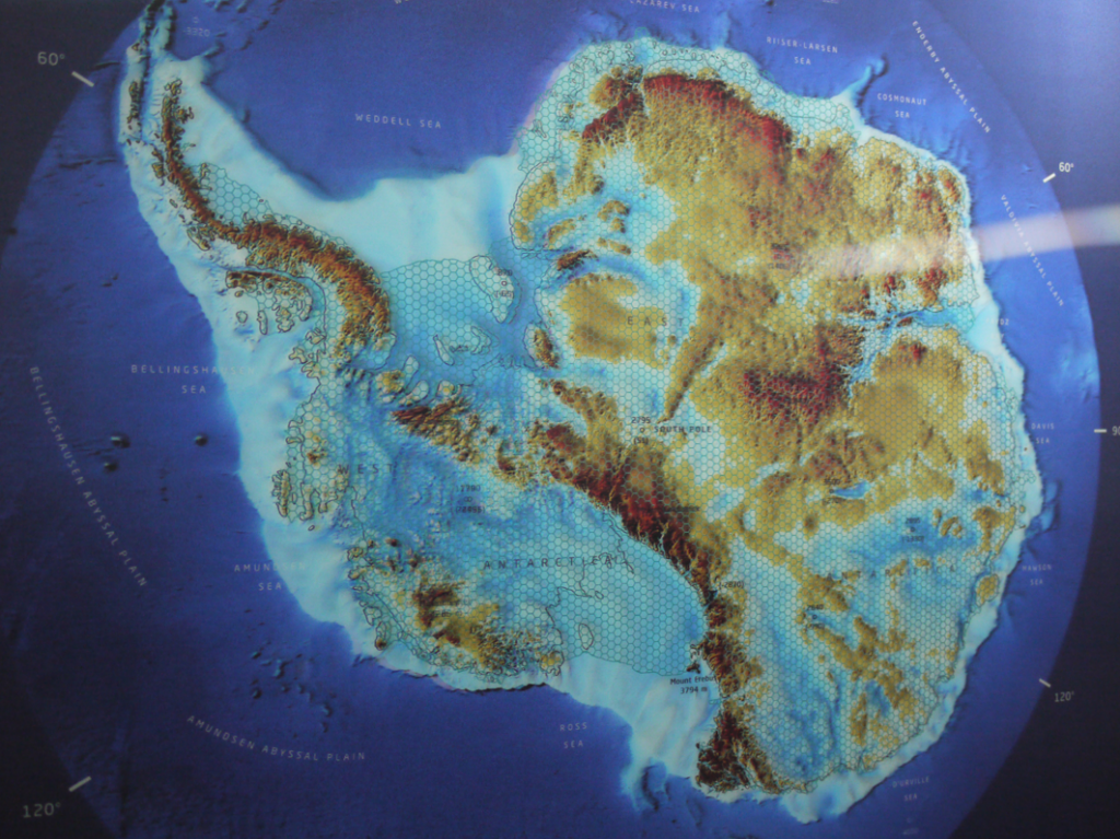
<div>Antarctica and the Southern Ocean Seafloor by M. Buchroithner and L. Radig
Difficult to show in a photograph but this map takes lenticular printing to a whole new level. The map, quite literally, has depth and makes excellent use of the medium showing different features as different layers.

<b>The Magnificent Bears by Annukka M
أكثر...
<div>Of course there's still real humdingers and cartofails but there always will be. The balance seems to be shifting as defaults in mapping tools improve and, hopefully, people's acceptance of sub-par products is waning. I've always maintained that quality beats quantity and great maps will always outshine the rest. It's therefore pleasing to see so many year-end reviews focus on what are actually good maps rather than just a list of viral click-bait cartography. I've seen some great maps this year and the fact this blog was difficult to compile to keep it to a manageable length is testament to that fact.
We've seen a good number of new books on cartography this year too. Jonathan Crowe put together his usual review so head on over there to see the highlights. I'm bound to put in a little plug for MAP (Phaidon Press) because I had some involvement. Lovely Christmas book for that map-mad family member or friend. Others are available.
Some year-end reviews are already out there which are well worth a look (Visualoop interactive maps part 1, Visualoop interactive maps part 2, Visualoop print infographics, Maps Mania). They generally focus on online/interactive maps although Visualoop's print infographics selections include many high-quality map-based products. Thanks to those who put some of my work in their lists
Here, then, I'd like to offer my selection of my favourite maps of the year which go beyond just reviewing what you can access online. Some you'll have seen because they are shared widely on the internet. Some I saw at various conferences and use that odd technique called 'printing and publishing'. That means they are on a medium called 'paper' so they might not have got the 'likes' that web offerings can garner. My criteria are simple...the map made me want to spend time with it. It was pleasing to look at and functions well in the context of its purpose. Sometimes I wanted to use the map to find something out. Sometimes I just wanted to look at it and enjoy.
So in no particular order...
A world of lotus, a world of harmony by Liao Zhi Yuan
A lovely little hand-drawn map by 15 year old Liao Zhi Yuan from China who won an award at the ICA Children's Map competition in Rio. Such a simple idea and beautifully drawn.
Flaming Gorge by Patrick Kennelly
Wonderfully atmospheric terrain rendering with sumptuous use of colour to pick out the water. Rather than just pick out terrain, the technique includes complex shadowing to create a stunning depth of tonal variation.
Route guide for the Cumbres & Toltec Scenic Railroad by Doug Cain
Situating the figural railroad against a beautiful backdrop, this is an old style strip map presented in three overlapping sections. Not every map has to fall in a single rectangle!
Graphical and Statistical Atlas of Switzerland 1914–2014 by Federal Statistical Office
A perfect example of how to make a thematic map atlas. great use of colour, typography and layout. If web cartographers want something to aim for in terms of visuals...just study this atlas.
<div>Antarctica and the Southern Ocean Seafloor by M. Buchroithner and L. Radig
Difficult to show in a photograph but this map takes lenticular printing to a whole new level. The map, quite literally, has depth and makes excellent use of the medium showing different features as different layers.
<b>The Magnificent Bears by Annukka M
أكثر...