With the next release of QGIS on the horizon, I downloaded the latest nightly build and looked through the visual change log to see what to expect. What I found is very exciting!
If you have not looked at QGIS Visual Change Log, it is a quick way to see changes from release-to-release. It includes screenshots and quick explanations of the upcoming changes. It also lists the contributor(s) and funding source.
Rasters
The new release includes log functions (natural and base 10) for the raster calculator. This is great since many remote sensing calculations use logs, for example land surface temperature via Landsat 8. Zonal Statistics for rasters is now included as a core plugin of QGIS. This allows users to summarize the characteristics of raster layers using a polygon layer for setting zones.
Symbology and Histograms
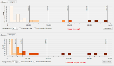
When you go to symbolize a layer using a graduated scheme, you can now adjust the breaks by using an interactive histogram, akin to what you will find in ArcGIS. If you change your classification scheme, be sure to (re)load or reclassify the layer before clicking on the histogram tab. Below is quick example using population by county for Maryland.
Live layer effects
Live layer effects is probably the most talked about new feature and was crowd-sourced. It adds the ability for a variety of effects including a drop shadow. The creator of this feature has a great post and quick how-to. Basically, when you got to style a layer, look towards the bottom, check the "Draw Effects" check-box. Then, look a fair way to your right and click the 'yellow star.'
I found using this to be much easier-to-use than its implementation in ArcGIS.
Follow point labeling
Good, clear, and legible labeling help separate the good mappers from the bad. Follow point labeling has been added to align text based on where the label is located. So, if a label appears to the left of a point, the text will be right-aligned. This will also help with multi-line labels.
True Curves
There is a new geometry engine which allows for 'true curves' to be represented as such -- instead of segmented lines or polygons. If I am not mistaken, I believe this is very important for a variety of users, but particularly for CAD users or those that use CAD and GIS.
New desktop icon
To start QGIS, the old familiar neon yellow/green "Q" is gone in favor of a more professional looking two-tone green globe for an icon. I am glad that the distinctive QGIS green remains, For those using both ArcGIS and QGIS installed on the same computer, it will still be easy to distinguish between the program icons.
أكثر...
If you have not looked at QGIS Visual Change Log, it is a quick way to see changes from release-to-release. It includes screenshots and quick explanations of the upcoming changes. It also lists the contributor(s) and funding source.
Rasters
The new release includes log functions (natural and base 10) for the raster calculator. This is great since many remote sensing calculations use logs, for example land surface temperature via Landsat 8. Zonal Statistics for rasters is now included as a core plugin of QGIS. This allows users to summarize the characteristics of raster layers using a polygon layer for setting zones.
Symbology and Histograms
When you go to symbolize a layer using a graduated scheme, you can now adjust the breaks by using an interactive histogram, akin to what you will find in ArcGIS. If you change your classification scheme, be sure to (re)load or reclassify the layer before clicking on the histogram tab. Below is quick example using population by county for Maryland.
Live layer effects
Live layer effects is probably the most talked about new feature and was crowd-sourced. It adds the ability for a variety of effects including a drop shadow. The creator of this feature has a great post and quick how-to. Basically, when you got to style a layer, look towards the bottom, check the "Draw Effects" check-box. Then, look a fair way to your right and click the 'yellow star.'
I found using this to be much easier-to-use than its implementation in ArcGIS.
Often, I feel my maps can get stale, or someone wants a more 'graphic' or photo-shopped look for a presentation, other product, or to develop a 'brand.' So having this feature is great, especially, if like me, you are not an expert graphic designer or cartographer. I look forward to seeing creative uses of this feature in the QGIS Flickr Map Showcase. There may already be a few in there!
Follow point labeling
Good, clear, and legible labeling help separate the good mappers from the bad. Follow point labeling has been added to align text based on where the label is located. So, if a label appears to the left of a point, the text will be right-aligned. This will also help with multi-line labels.
True Curves
There is a new geometry engine which allows for 'true curves' to be represented as such -- instead of segmented lines or polygons. If I am not mistaken, I believe this is very important for a variety of users, but particularly for CAD users or those that use CAD and GIS.
New desktop icon
To start QGIS, the old familiar neon yellow/green "Q" is gone in favor of a more professional looking two-tone green globe for an icon. I am glad that the distinctive QGIS green remains, For those using both ArcGIS and QGIS installed on the same computer, it will still be easy to distinguish between the program icons.
أكثر...

